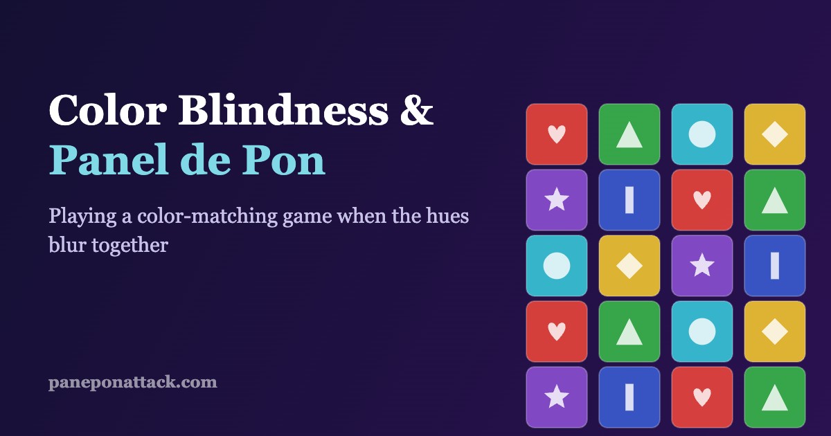
Here is an uncomfortable question for a puzzle series built entirely on matching colored blocks: what happens when you cannot reliably see the colors? Roughly one in twelve men and one in two hundred women has some form of color vision deficiency, most commonly red-green. Panel de Pon asks you to line up three or more same-colored panels, at speed, under a rising stack, while planning a chain two moves ahead. On paper it is the least accessible genre imaginable for a color-blind player. In practice, it is far more playable than Tetris veterans or Puyo mains might guess — because the designers, whether by intention or happy accident, never relied on color alone.
This is a piece about that gap between the paper problem and the real experience. If you are new to the series, the what-is-Panel de Pon primer covers the basics; here we are looking specifically at how the board communicates, and how to make it communicate better when hue is unreliable.
The colors Panel de Pon actually asks you to tell apart
The standard board uses six panel types. Across most versions the palette lands on red, green, cyan (light blue), yellow, purple, and a sixth that varies — often a darker blue or a distinct teal. That set is a near-worst-case spread for the two common deuteranopia and protanopia profiles. Red and green collapse toward the same muddy brown-gold. Purple loses its blue component and starts leaning toward the same red channel. Cyan and green can drift together in low light. Under the pressure of a fast raise speed, three of your six colors can look like variations of one or two.
If the game had shipped as pure color, that would be the end of the story: unplayable at speed. It did not. Every panel carries a second signal.
The panel symbols are the real accessibility feature
Look closely at any panel and you will see an embossed icon at its center — a heart, a star, a diamond, a circle, a triangle, and an up/down or exclamation mark, depending on version. These were added for visual clarity and charm, but they double as a shape-redundancy layer. The specific icon-to-color pairing shifts between the SNES original, the Game Boy releases, and the later ports, so it is worth learning the pairing on your version rather than memorizing a universal chart. What matters is the principle: you are never matching only color. You are matching a color-plus-shape token, and the shape survives even when the hue does not.
Reading by shape, not by hue
For a color-blind player the practical move is a deliberate perceptual shift: stop tracking “the green ones” and start tracking “the triangles.” It feels slower for the first hour because you are overriding an instinct the game trains in everyone else. But shape reading has a hidden advantage — it is immune to the palette washing out as the stack darkens near the top of the field. A green panel and a cyan panel three rows up in a dim column can be nearly identical in hue; their icons are not. This is the same discipline strong players use when they scan the board structurally rather than chromatically, which the frame-by-frame breakdown of panel states gets into from a different angle.
The two hardest situations, and how they differ
Not all color confusion is equal. Two specific board states cause the most trouble.
The first is the dim peek row — the sliver of upcoming panels creeping up from the bottom edge. It renders darker and smaller than the active field, which crushes what little hue separation red-green players had to begin with. Symbols help here, but the icons are also smaller in that row. The fix is less about seeing it perfectly and more about not depending on it: plan from the panels you can read clearly and treat the peek row as a rough hint rather than exact information.
The second is garbage clearing, where a block of incoming garbage transforms into a mixed wall of colored panels all at once. Suddenly you have a dense grid of new tokens to parse under time pressure. Shape reading scales better than color reading here because your eye can sweep for one icon at a time instead of trying to hold five hues in working memory. When the board gets loud, narrow your search to a single shape and build around it.
Palette swaps, shaders, and rom hacks that help
If you play on emulator or a flash cart, you have options the original hardware never offered. Palette-swap patches can push the six colors toward a deuteranopia-friendly spread — typically dropping one of the reds or greens toward blue and boosting luminance contrast so that even without hue you get a clean light-to-dark ladder. Some emulators also expose color-blind correction shaders (daltonization filters) at the system level, which remap the output in real time without touching the ROM. Neither is perfect: shaders can smear fast-moving panels, and aggressive palette hacks sometimes break the peek-row dimming logic. Test them against a real match, not a static screenshot. The emulator accuracy and rom-hacks guide is the right starting point for setting these up without wrecking timing.
One underrated middle path: raise the display’s overall contrast and brightness before touching anything game-side. A surprising amount of red-green confusion in this series comes from the panels being rendered too dark, not from the hues themselves. Fixing luminance first often does more than any filter.
Play-side habits that reduce color dependence
Hardware and patches only go so far. The bigger lever is how you play. Three habits help.
Control the tempo. The manual raise button lets you push the stack up on your terms, but so does not pushing it. Keeping the stack lower and the raise slower buys reading time, which matters far more when each read costs extra effort. This connects directly to danger-state awareness covered in reading the board and managing the danger state.
Move the cursor less. Every cursor trip across the board is a chance to misread a color mid-motion. Planning a route before you move — cursor economy — cuts the number of split-second color judgments you make under stress.
Build with shapes, verify with color. Lead your matching decision with the icon, then use whatever hue you can perceive as a confirmation rather than the primary signal. Getting the order right — shape first, color second — is the single mental habit that turns the game from frustrating to fluent.
What a modern revival should get right
If the series ever returns, accessibility is low-hanging fruit. A built-in color-blind mode with selectable deuteranopia, protanopia, and tritanopia palettes; a toggle to enlarge and brighten the peek-row icons; and an option to increase symbol contrast independently of color would cost little and open the game to players who currently rely on emulator hacks. The symbols already do most of the work. A revival just has to make them adjustable rather than fixed — and treat the shape layer as a first-class feature, not decoration.
Frequently asked questions
Can you actually play Panel de Pon well if you are color-blind?
Yes. Because every panel carries a distinct embossed symbol in addition to its color, you can play by matching shapes rather than hues. It takes an adjustment period to override the color instinct, but competitive-level play is achievable, especially with contrast tuning or a color-blind-friendly palette.
Which colors are hardest to tell apart in Panel de Pon?
For the common red-green deficiencies, red and green are the worst pair, with purple sometimes collapsing toward red and cyan drifting toward green in dim areas of the board. The dimmed peek row at the bottom makes all of these harder because it lowers contrast.
Do the panel symbols change between versions?
The set of symbols is consistent — heart, star, diamond, circle, triangle, and an up/down or exclamation mark — but which icon pairs with which color can differ across the SNES, Game Boy, and later ports. Learn the pairing on the version you play rather than assuming a universal chart.
What is the fastest single fix for color confusion?
Raise your display’s brightness and contrast first. A lot of red-green confusion in this game comes from panels rendering too dark, and fixing luminance often helps more than any color filter or palette hack.
Are there palette hacks that make it easier?
Yes. Palette-swap patches can shift the six colors toward a color-blind-friendly spread with a clearer light-to-dark ladder, and some emulators offer daltonization shaders that remap colors in real time. Test either against a live match, since fast panel motion can expose artifacts a screenshot will not.
Panel de Pon looks like the one genre a color-blind player should skip. It is the opposite: a color game that quietly hedged its bets with shapes, which means the tools to play it well are already on the screen — you just have to decide to read them.